When we look at real estate data, we usually focus on one number: 𝗧𝗵𝗲 𝗣𝗿𝗶𝗰𝗲.
But price only tells us where we are—it doesn’t tell us where we are going.
To understand the true health of the Denver market, you have to look at two different stories at the same time:
𝟭. The Price Level (Where we are today)
𝟮. The YoY Growth Rate (How much “gas” is in the tank)
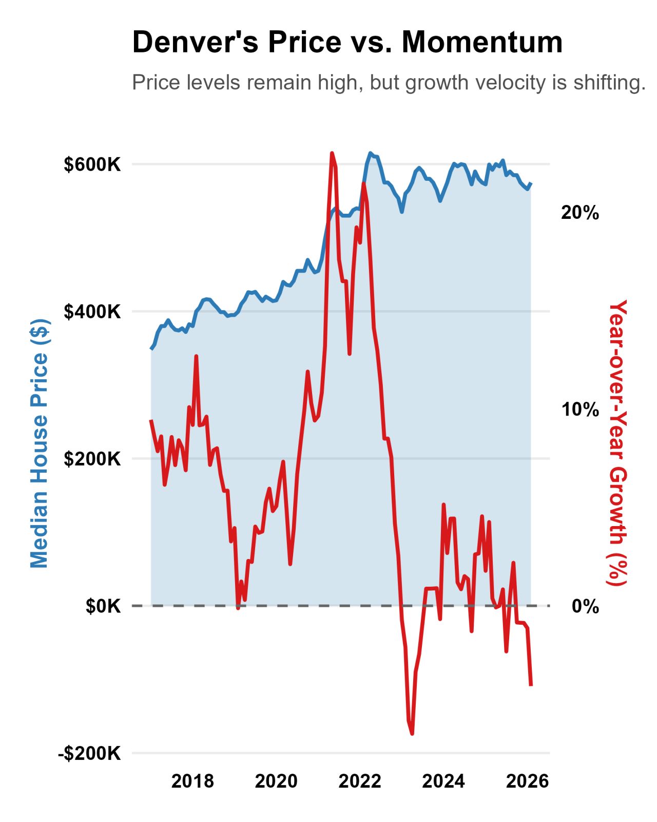
I’ve been diving into 10 years of Denver housing data, and the relationship between these two metrics is eye-opening. While median prices (the blue area in the chart) often hit record highs, the “Growth Velocity” (the red line) is the leading indicator that tells us when the market is starting to cool—long before the prices themselves actually flatten out.
The “Two-Part Story” of the current market:
📈 The Altitude:
Prices have climbed significantly over the last decade, showing the long-term resilience of Denver real estate.
📉 The Momentum:
The Year-over-Year growth rate shows us the “velocity.” When that red line starts to dip, it’s a sign that the hyper-competitive “gas” is leaving the tank, leading to a more normalized market for buyers and sellers alike.
In data science, we call this the difference between magnitude and momentum. In real estate, we call it the difference between “𝙒𝙝𝙖𝙩 𝙞𝙨 𝙢𝙮 𝙝𝙤𝙢𝙚 𝙬𝙤𝙧𝙩𝙝?” and “𝙃𝙤𝙬 𝙛𝙖𝙨𝙩 𝙞𝙨 𝙩𝙝𝙚 𝙢𝙖𝙧𝙠𝙚𝙩 𝙘𝙝𝙖𝙣𝙜𝙞𝙣𝙜?”
Whether you’re a homeowner or looking to buy, keep your eye on the velocity. It’s the best way to see a curve in the road before you hit it.